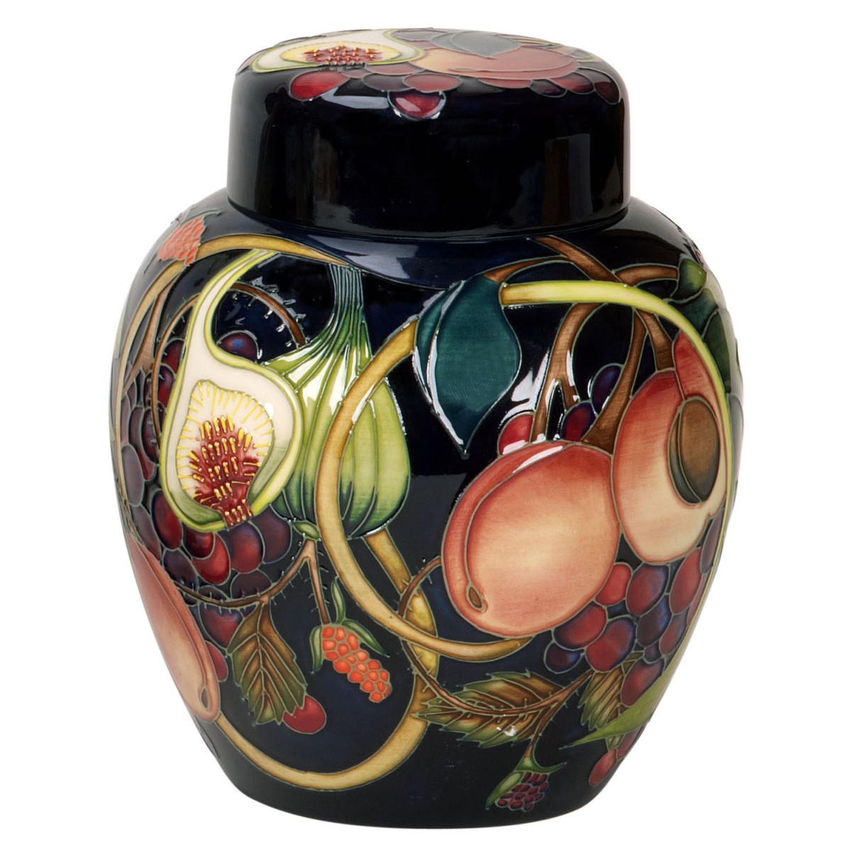
It is beyond doubt that Emma Bossons’ Queen’s Choice design is not only one of the two longest running Moorcroft designs, the longest running design being Anna Lily, by Nicola Slaney, in the historic art pottery’s illustrious history but it is also considered to be Moorcroft’s trademark design, synonymous with all that is Moorcroft and holding our hope for a fruitful future. In short, this design may be said to be the greatest Moorcroft design of all time.
Inspired by Shakespeare's play A Mid-Summer Night's Dream, every fruit mentioned by Shakespeare’s Queen of The Fairies, Titania, in Act 3, Scene 1, is found in the design. Titania orders her retinue of fairy attendants to wait on her new lover Bottom. They are commanded to courtesy to him and bring him all the treasures of the wood. These include fruits, honey, beeswax candles, and butterfly wings to shade his sleeping eyes from the moonbeams. The Fairy Queen is smitten by Bottom, who is to receive the royal treatment only by the act of magic, a spell caste by Oberon, King of the Fairies. Titania declares, 'Be kind and courteous to this gentleman; Hop in his walks and gambol in his eyes; Feed him with apricots and dewberries; with purple grapes, green figs and mulberries...'
Decades ago, a young Moorcroft designer, Rachel Bishop, took on the reins of Moorcroft design singlehandedly at the tender age of 24, and laid the foundations for Queens Choice with her Oberon (1993) design. Not only was Oberon an enchanting design by Rachel, rich with cherry-blossom pinks, soft honey-yellows, and deep, regal-purple honeysuckle flowers forming the basis of the decoration but it held something to ensure that loves mystery was not lost – sublime pink and twilight blue hues to the background. For the first time in Moorcroft’s history, literature was aligned with art, with the colours and design emitting a real ethereal feel to the piece, reminiscent of the King of the Fairies himself. Fortunate is the man or woman who has this piece in their collection. Unquestionably, Oberon is, without doubt, a design of equal merit to Queen’s Choice and many wonder why it has lacked the longevity of Queen’s Choice, a fruit bearing design. With that in mind, we need to delve deeper into this curious Moorcroft design.
Queen’s Choice has been in production for a remarkable 22-years. Each year, Moorcroft considers whether sales of the design warrant catalogue inclusion for another year, and each year the returns prove that it is a worthy contender. This is truly remarkable. Most Moorcroft ranges usually last an average of five years. It is almost as if the design must stand in perpetuity for some reason.
Never before, have colours appeared so luscious, a feast fit for a Queen. Whilst Moorcroft were made Potters to HM The Queen almost a century ago, the Queen that holds the name of this design is, as we have said, Titania, Queen of the Fairies. In her bower she feeds her guest the fruit of her desires: dewberries, grapes, figs, mulberries and apricots. The colour contrast and sectional fruit depicted by Emma is alive with richness and texture. Figs are an ancient fruit, cultivated for centuries and regarded as a sacred symbol by many, holding delicate, abundant, and edible seeds, signifying universal understanding, unity, and truth. The tiny, jewel-toned specks, unified in their purpose of creating more life; a mass of hope.

For a Moorcroft tubeliner, the fig becomes a means of demonstrating excellence in the heritage skills of applying liquid clay slip by hand before being infiled with reddish-pink metallic oxides. Lime green and yellow tubelined colours are also used to add a three dimensional vibrancy, with the fruit’s pips dotted one by one in tiny roundels of equal parity. Impossibly difficult. The shape of the fruit itself, the tear-drop silhouette that fills your hand with softness, works like the pomegranates featured in William Moorcroft’s famous Pomegranate design of 1925 pictured below. In truth, the master potter himself, also used sectional fruit to add another dimension to the design and colouration; revealing hidden parts.
.jpg)
This large Pomegranate vase was as designed by William Moorcroft in circa 1925. The vase holds the signature Moorcroft cobalt blue ground, with a series of pomegranates, dissected and whole, ringing the circumference of the vase with grapes on a vine – imagery evocative of William’s deeply religious mind-set with the use of biblical fruit. Pomegranates first appear in Scripture in Exodus 28:33–34 when God instructs Moses about the robe for the high priest, Aaron. "On its hem you shall make pomegranates of blue and purple and scarlet yarns, around its hem, with bells of gold between them, a golden bell and a pomegranate, a golden bell and a pomegranate, around the hem of the robe," and vines, with Jesus Christ himself referred to as the True Vine.
In essence, Emma is holding on to the invisible chord of the Moorcroft forefather by dissecting her figs and apricots. It should be noted that figs are plentiful, their trees sprouting bi-yearly crop, so it seems only natural that the fig should connote just that: abundance. This rich design is complete with the intense burgundy hues of mulberries and grapes, adding an opulent dimension to the design against the contrasting pale amber-red hues of the ripe apricots which orbits like the setting suns radiating from contrasting dissected stones coloured like fossilized tree resin. Even a skilled designer knows that creating a fruit design or work of art is far from easy – you only have look at still life fruit paintings in mid-century modern oils to realise that they can so easily turn into childish renditions.
Is the fruit in Emma’s design a mirage? Temping mortals to act strangely or does the design hold something for us to consider deeply? Does the design epitomise the fruit of our labours or indeed, loves labour lost? It may be that the work of Emma Bossons is not unlike that of the late Renaissance artist, Giuseppe Arcimboldo, where fruit design can literally be turned on its head to give another image. There is so much more to the Queens Choice design than can readily be explained. Queens Choice is not simply a still life watercolour of fruit wrapped around the shape. It holds the movement of great Art Nouveau designs, with fruit tumbling, one over another, in a joyful, sumptuous richness and movement. Within the design, it can perhaps be said that Emma has conjured fruit shapes, colours and raised-tubelined forms to beguile and entice in much the same way as those fairies play with the passions of mortals.
So there we have it. As the sun streaks across a midsummer eve each year, and mischievous fairies dart their eyes from side to side, Moorcroft designer, Emma Bossons, can be said to have followed Moorcroft’s senior designer to a place of exceptional beauty by placing something remarkable back into Moorcroft - a fruit design crowned above all other Moorcroft designs from a design window that was open by William Moorcroft over a century ago.
.jpg)
